Website Audit & Tehcnical Issues for Dallas Transportaion Services
Client
A premium transportation company offering luxury and executive limo services, aiming to enhance their website’s UI/UX, content quality, and conversion potential.
Objective
To manually audit the website with a focus on usability, design consistency, and performance — without relying on automated tools — and provide a categorized, actionable report to improve the site experience and customer engagement.
Audit Highlights
I conducted a fully manual audit using a real-user perspective to simulate how visitors interact with the site. My focus was on identifying gaps in:
- UI consistency
- Technical structure
- Content quality
- Visual hierarchy
- Trust-building elements
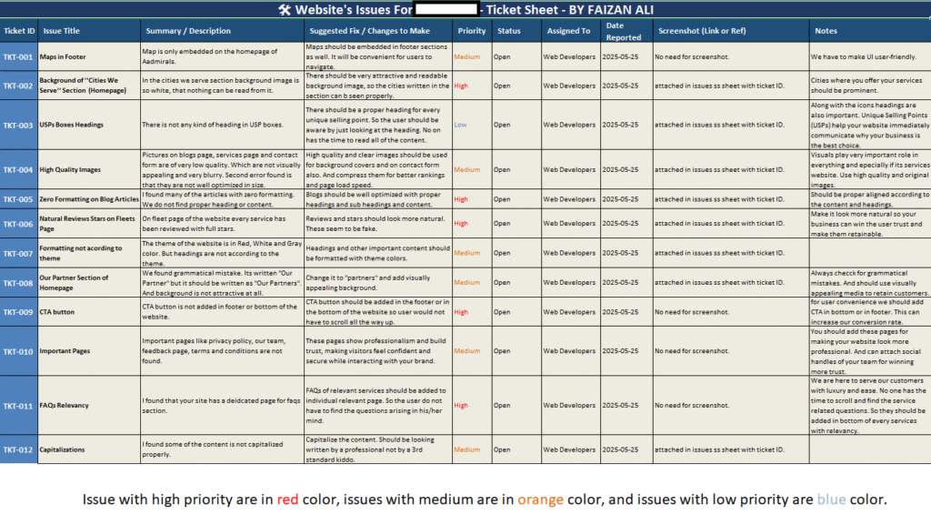
Each issue was logged in a structured ticketing system with:
- Ticket ID
- Issue Summary & Description
- Suggested Fix
- Priority Level (High, Medium, Low)
- Status & Notes
Key Findings
Below are a few critical issues from the audit:
High Priority (Red)
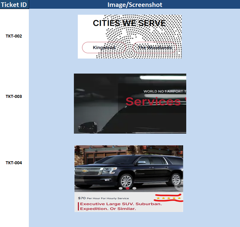
- Unoptimized Background Images: Important sections like “Cities We Serve” had unreadable content due to poor background contrast.
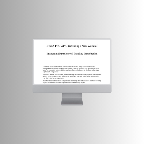
- Lack of Optimization in Blog Articles: Articles were missing structure, headings, and basic SEO formatting.
- Misaligned CTAs & Missing Elements: CTA buttons were not placed in footer areas, leading to reduced conversions.
- Fake-looking Review Stars: Reviews lacked authenticity and design consistency, potentially harming credibility.
Medium Priority (Orange)
- Poor Color Formatting in Headings: Color inconsistencies clashed with the theme and branding.
- Missing Important Pages: Key trust pages like Privacy Policy, Terms, and Feedback were absent.
- Grammar & Content Issues: “Our Partner” text had grammatical errors, and some headings lacked capitalization.
Low Priority (Blue)
- Weak USP Sections: USP boxes lacked clear headings and immediate value statements.
- Irrelevant FAQs: FAQs existed but were not tailored to customer concerns.
Each issue was also visually supported with screenshots and annotations for easier implementation.
Approach
- Page-by-Page Manual Review: I navigated the site across devices and resolutions to identify real-time UX and design issues.
- Visual & Written Documentation: All findings were recorded in a clean, easy-to-follow table format. Screenshots were taken for clarity where needed.
- Priority-Based Categorization: I segmented the issues into High, Medium, and Low priority based on their impact on business goals, SEO, and user experience.
Deliverables
- A complete, color-coded issue sheet
- Annotated screenshots for developers
- Suggestions aligned with best practices and client goals
- UX improvement strategies that require minimal redesign but yield high impact
Impact & Client Value
✅ Clear roadmap for developers to fix high-impact issues first
✅ Better alignment with brand theme and customer expectations
✅ Increased potential for lead generation via better CTA and navigation
✅ Enhanced trust through improved content structure and professionalism
Manual audits can reveal what tools often miss.
This case study is a perfect example of how real-user thinking and attention to detail can dramatically increase a brand’s web presence, even before a single redesign is done.
- Website Audit
- Technical SEO
- Digital Marketing
- Web Design
- On-Page SEO

